Typography in Design: Why Every Designer Should Master Fonts and Styles was originally published on Springboard.
What connects 3400 BC Iraq, 3200 BC Egypt, 1300 BC China and 600 BC Mesoamerica? Writing. Thousands of years ago, humans began writing pictorial signs in these four parts of the world, which slowly evolved through cuneiform, hieroglyphics, symbols, and codices to the alphabets we use today. From being merely a matter of record, these letters grew to serve various purposes.
For instance, ornate styles were used in the letters sent by monarchs, representing power and wealth. Clear, straightforward styles were used for street signs and other public messages to be more readable. Early technology used minimal fonts that could be replicated on digital devices.

In today’s modern, internet-powered world, typeface—a collection of alphabets, numbers, and punctuation—has gained far more significance. Over 90% of all information online is text. Even in visual representations such as presentations, infographics, and memes, text plays a key role.
Therefore, in digital user experience (UX) design, typography is design.
Typography, the art of arranging textual elements such as typeface, relative size, spacing, etc., dramatically influences the design’s ability to attract attention and communicate the intended message. A user interface (UI) designer’s ability to choose the right typography for every screen they design is the difference between someone stopping to read or skimming through mindlessly.
In this blog post, we explore the role of typography in UI/UX design. We explore:
- What is typography?
- Why is it important in UX design?
- How do you use typography in UI design?
What Is Typography?
 Source: Dribbble
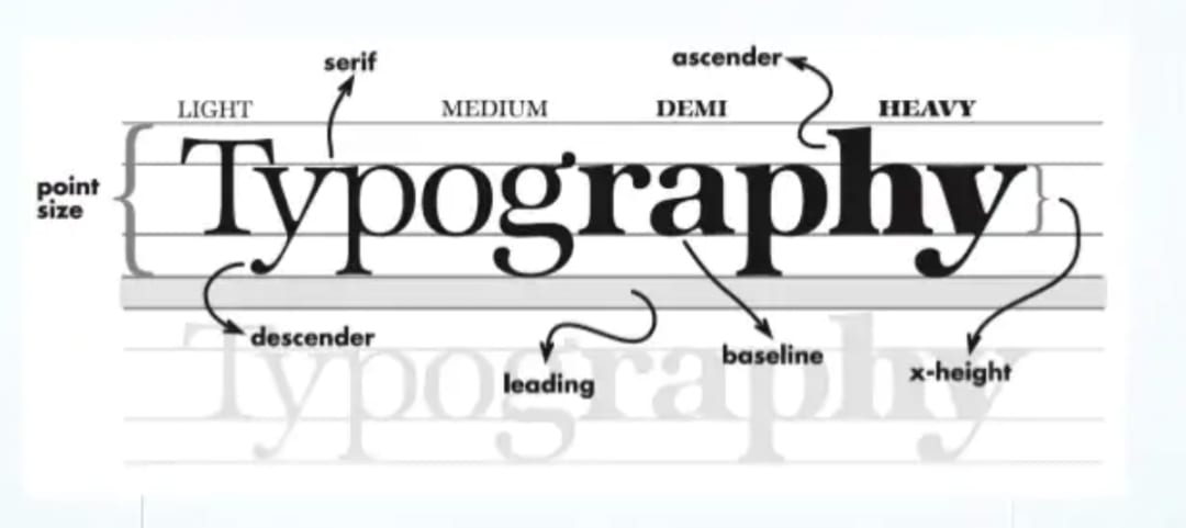
Typography is the art of arranging a typeface in the right combination of shape, size, and spacing.
The primary purpose of typography is readability, accessibility, and hierarchy. A UI designer’s job is to ensure that the text is:
- Clear and readable. Alphabets need to be distinguishable from one another. The space between letters, words, and sentences needs to be consistent.
- Accessible. The text should be readable for users with blindness, vision loss, and reading disorders.
- Hierarchy. Users need to be able to differentiate information of varying importance.
Let us look at an example to demonstrate this. Below is the screenshot of the home page of Apple.

On the clarity and readability scale, the page scores high. The title is in dark grey and large font, making clear what we’re reading about. The links in blue indicate they’re clickable. The small arrow next to the links indicates they take you to another page.
For some users, the light grey text of the description might be too light, affecting accessibility. However, given it is the least important information on the page, it can be comfortably skipped.
The visual hierarchy of information is clear as it can be. The product is introduced in large title font. The core value of speed—“Blast past fast”—is written in heading-level font to attract attention. Though they come forth in the order of arrangement, the links are the third most important item in the hierarchy. They are written in blue to reiterate their importance.
As you can see here, the font size, font-weight, color, and relative location play a significant role in typography design. Here’s why.
Why Is Typography Important in Design?
Given that a vast majority of the information online is presented as text, the importance of typography cannot be understated. While the images and design elements can be striking, it is the text that often communicates the message. To ensure that the message is communicated clearly, in the proper order, in a short span of time, typography is critical. Here’s what good typography can do for visual design.
1. Communicate unambiguously
Whether the user is skimming casually or reading intently, typography makes their journey easier for them. It enables them to:
- Grasp the information as quickly as possible, without having to pay more attention than necessary
- Skim through all available content to later dive into what they want to read more of, improving navigability
- Identify repetitive items easily. For instance, on the above page, when the user sees blue text with an arrow next to it, they understand that it’s a link.
2. Be attractive
![]()
Given the vast amount of content and websites on the internet, users are spoilt for choice. They are more likely to get their news/information from places that offer a more visually pleasing experience. Good typography enables this. It can:
- Attract attention through size, weight, or even color
- Set the mood. For instance, handwriting fonts can offer a sense of familiarity and friendliness to the user
- Evoke connections. The Coca Cola font or the Disney font evokes nostalgia and emotional connections even when presented in plain black and white
3. Build the brand
There is a reason why brands choose specific fonts and stick to them, not only in their logos but across their communication collaterals—brand recognition. Using the same set of fonts builds recognition, consistency, and a sense of harmony throughout the visual design. As a result, users get the same brand experience wherever they go.

For instance, The New Yorker’s Irvin font is instantly recognizable with the large round ‘o’ and the slanted ‘s’. Likewise, Apple is known to use their latest font San Francisco not just on their website but throughout the UI of all Apple devices to give a consistent experience for customers and prospects alike.
4. Influence decisions
Websites and mobile apps need people to take action, sign up for a newsletter, share an article, or even buy a product. Typography plays a crucial role in influencing such decisions. For instance, using highlight to show a limited time offer conveys urgency, influencing the user to take action. Red fonts/backgrounds are used to warn people about taking undesirable actions.
How To Use Elements of Typography in UX Design
Today, most designers understand that fonts play a role in user experience design. However, typography is a lot more than just choosing fonts. It is a complex combination of how text is arranged in relation to the design. This comes from a wide range of factors.
1. Typefaces and fonts
A typeface or font is a collection of alphabets, numbers, and punctuation consistent with one design. The three basic kinds of typefaces are serif, sans-serif, and decorative fonts.
- Serif refers to typefaces with a small line or stroke at the end of a larger stroke in a letter or symbol. They are used in body text and seen as more readable, especially in print. Popular serif typefaces are Times New Roman, Caslon, Garamond, etc.
- Sans-serif—literally meaning the absence of the serif—refers to fonts that don’t have the extra stroke. They are more popular in digital interfaces. Commonly used sans-serif fonts include Arial, Helvetica, Roboto, etc.
- Decorative fonts are intricate and creative ones, typically used in titles, logos, banners, etc. Engravers’ Old English and the Harry Potter logo fonts are great examples.
![]()
UI designers today use a combination of 2-3 fonts, each serving a different purpose. For instance, they might use a serif or a decorative font for the title, regular sans-serif font for body text, and bolder variations for calls-to-action such as buttons.
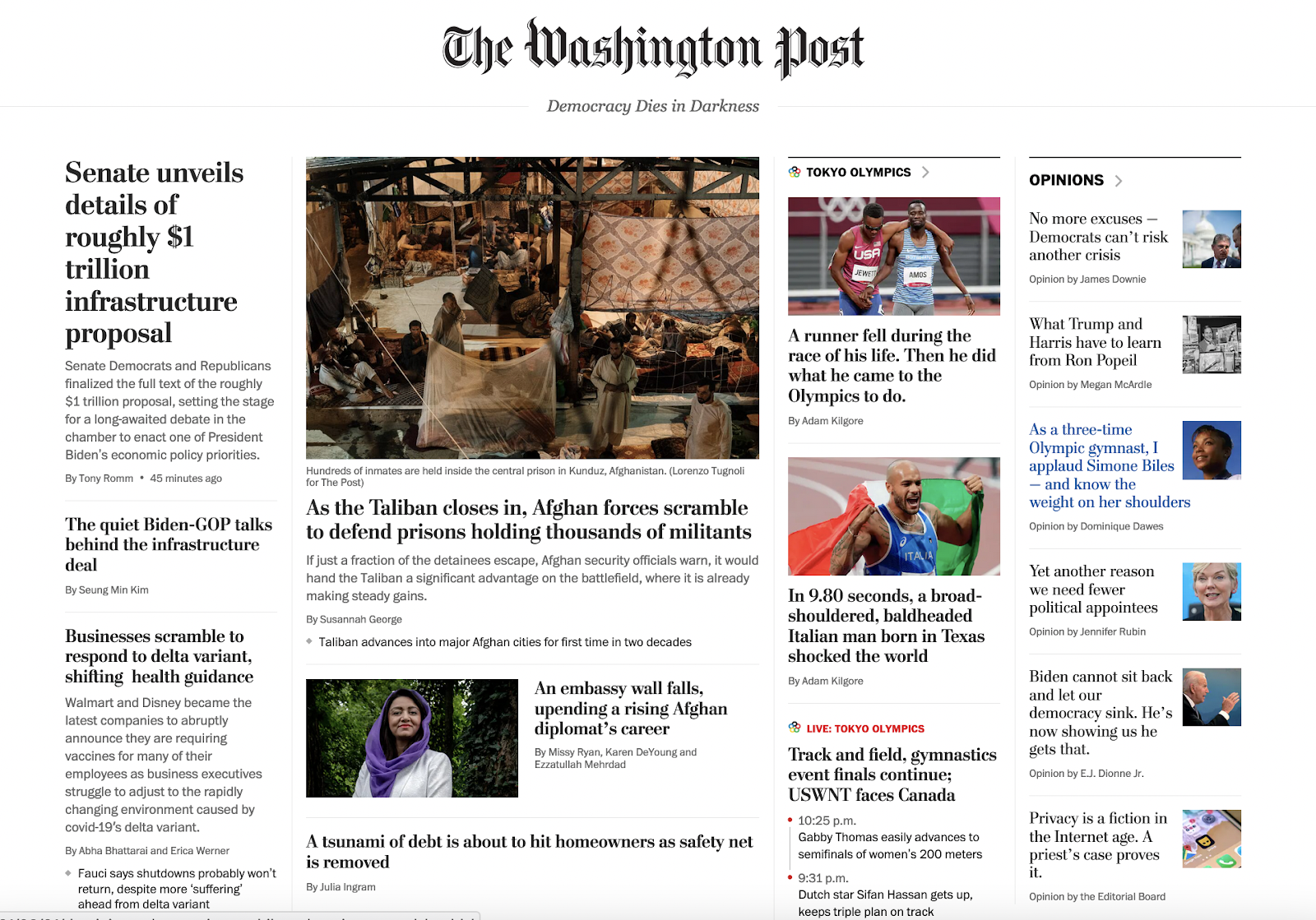
Let us take an example of The Washington Post website to understand typography in detail. To begin with, the website uses serif and sans-serif fonts, the former for titles and the latter for the rest of the copy. It also uses various sizes of the same font to denote importance. For instance, the description text and the author’s name are in the same font, albeit in different sizes.
2. Weights, widths, and styles
If you’ve ever written a document or made a presentation, you would know bold, italics, and underlining. Many fonts offer a lot more weights and styles.
Here are the 18 variants available for the Google font, Montserrat.


It is not uncommon today to see multiple variants of each font within the same website. Some also alter the font width to shape its style, making them narrower (condensed) or wider (expanded) to fit the design.
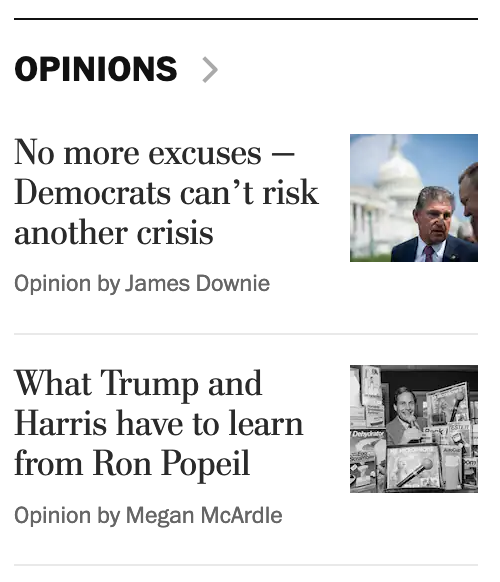
For instance, the section titles are in bold as in the screenshot above, where the word ‘opinions’ has a higher weight than any other text to ensure readers don’t confuse it to be news.
The description is in italics to signify that it is a summary of what to expect.
3. Character spacing
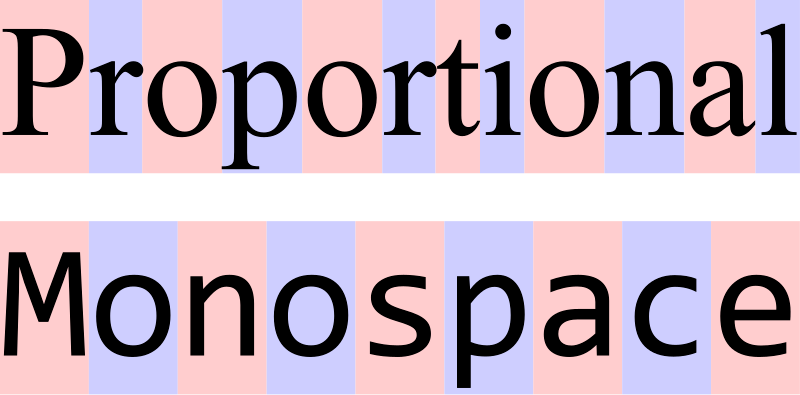
Character spacing refers to the space between letters, words, and lines. In terms of spacing, there are two kinds of fonts—Proportional and Monospace. Proportional fonts occupy only as much space as the letter needs, usually believed to be more pleasing to the eye. Monospace fonts are fixed-width, believed to be more readable; they are popular coding interfaces and text editors.
Designers use character spacing in myriad ways:
- They increase character spacing in titles to make them look bigger without increasing font size
- They increase the line spacing of the first line in any paragraph to make the text more readable
- They reduce line spacing to show a closer connection between two design elements without making any physical connection between them
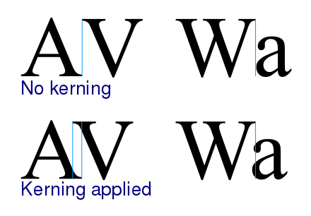
A nifty trick used in web design is kerning, the process of adjusting the space between characters in a proportional font to make them more pleasing.
4. Color
In visual design, color is defined by three components—hue, saturation, and value. Hue refers to the shade of color, saturation to the intensity of the color, and value shows how light or dark the color is. Designers use a combination of these three components to make the text attractive and legible.


For example, on The Washington Post homepage, the only title in red is the live coverage section. In a sea of news, this indicates both immediacy and the evolving nature of updates. On the other hand, when you hover over any news item, it turns a mild shade of blue to show the user what they are about to click on.
5. Contrast
Contrast is the technique of using two different methods for emphasis. This can be achieved by contrasting sizes, colors, weights, etc. UI design best practice is to ensure 4:5:1 contrast between all text and background.
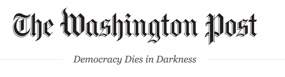
The Washington Post masthead is a classic example of using multiple design elements for contrast. As you see here, the tagline is in lighter grey, smaller size, different font, and in italics, making it complementary to the title, but in no way taking away attention from it.
6. White space
White space refers to the distance between elements in a design. Though it often goes unnoticed, white space is crucial in making text legible. While too little white space can make your interface seem cluttered, too much can take away from the dynamism of your screen.
7. Alignment
Alignment is what determines the position of each element on the page in relation to one another. It plays a crucial role in making the design look organized. There are four kinds of horizontal text alignment: Right, left, center, and justified. And three types of vertical alignment: Top, middle, and bottom. Left alignment is best for flowing text because it’s easier to read. However, if your content is in Arabic or other languages that are read from right to left, right alignment is better.
Typography Is Design

Often, visual designers see typography as an afterthought. While focusing on graphic design, illustrations, colors, icons, etc., many forget that good typography can do as much for your user interface, if not more. Good user interface designers treat typography as design. They understand that it is an integral part of the UI. They build toolkits and processes that leverage typography for visual impact.
Ready to switch careers to UI/UX Design?
Springboard offers a comprehensive UI/UX Bootcamp that has dedicated modules on fonts and typography. While learning style guides, design elements, and prototyping, you will also learn to use typography to your advantage. No design background required—all you need is an eye for good visual design and the ability to empathize with your user. In the course, you’ll work on substantial design projects and complete a real-world externship with an industry client. After nine months, you’ll graduate with a UI/UX design mindset and a portfolio to show for it.
Check out Springboard’s UI/UX Design Career Track to see if you qualify.
Not sure if UI/UX design is the right career for you?
Springboard now offers an Introduction to Design course. Learn what designers do on the job by working through a project with 1-on-1 mentorship from an industry expert. Topics covered include design tools, research, sketching, designing in high fidelity, and wireframing.
Check out Springboard’s Introduction to Design Course—enrollments are open to all!
The post Typography in Design: Why Every Designer Should Master Fonts and Styles appeared first on Springboard Blog.